Pay attention to your last purchase. What made you buy? Did you really need that item or other factors, such as the packaging of your product? Creative packaging of various products: food, health and cosmetics and…. They have an amazing impact on your choice of shopping.
Sometimes the design on the cover and package of products evokes certain emotions that, despite the similarity of the contents of the package, the desire to buy a particular product is formed in you. For example, you may have experience buying a beautiful shampoo bottle simply because of its attractive appearance. The packaging of the products in a significant way, awakens a special feeling in the buyer; To attract his attention and senses. Packaging of food and other products is very important in sales and marketing.
Here are some great examples of creative product packaging:
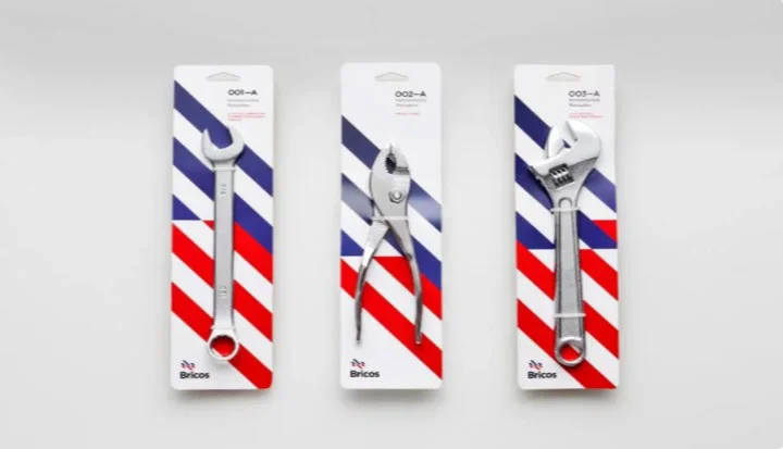
1. Use patterns
With simple designs and suitable colors, the packaging of products can be made very attractive and beautiful. A simple design with the help of familiar elements can be eye-catching and attractive. For example, to package tools, you can simply use colors and designs that convey a specific identity and implicit meaning.
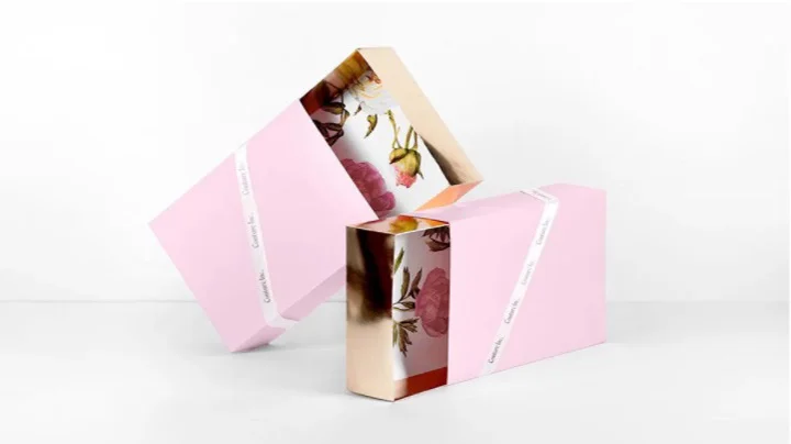
2. Proper use of volume and space
In designing food packages, you should pay enough attention to all the volume and space you have. For example, in the example you see in the picture above, the flower design is used, in addition to the fact that it seems to be divided into 2 parts, it shows it to be bigger and in general it will be more beautiful and stylish.
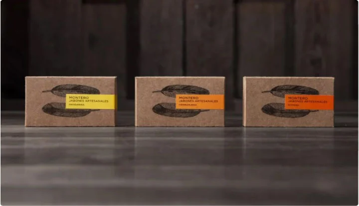
3. Use simplicity
Sometimes simplicity is all you need in product packaging. For example, designs that evoke a sense of recycling and return to nature will create a good connection with the audience. The feathers in the image above, in coordination with the appropriate colors, create a desirable effect in the mind.
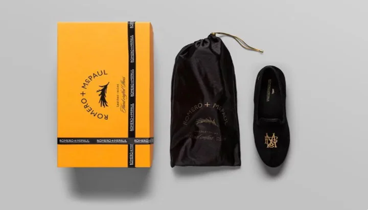
4. Pay attention to the type of customer and his experience
Pay close attention to the type of customer, the goal and the experiences that each group of customers have. For example, in the image above, the product, which is a kind of comfort slipper, has a luxurious and special design and packaging, despite being in the category of not so luxurious products, because it belongs to a specific group of targeted customers.
5. Packaging as a complement to the product
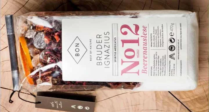
Product packaging should complement the contents of the package. In this form, the transparency of the package makes it well visible inside. There is a kind of honesty and clarity in this type of packaging that makes the customer confident in buying the item; Because the manufacturer has shown honesty and confidence in the package.
6. Funny and fun
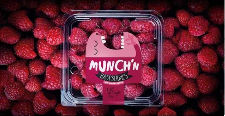
Using humorous elements will make the audience pay more attention to your product than usual. For example, in the example we have put here, both the color and the image used are attractive, funny, and product-related. In addition, the resolution inside the package, as mentioned earlier, along with the design on the package, indicates the honesty of the manufacturer and the quality of the product.
7. Prominence and index
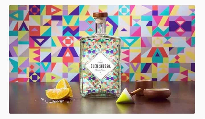
The use of multiple colors and prominent and interesting images that are slightly contrary to visual habits also attracts the customer’s attention. For example, in the image above, different colors, while attracting the customer’s gaze, also evoke a sense of joy and cheerfulness in the mind.
8. Deconstruct
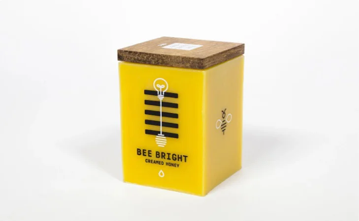
You need to be a little more deconstructive when you are producing a product that is very popular and other examples of it are in close competition with other brands. Honey, for example, is usually packaged in jars or plain jars. In this case, it is better to get help from a new and non-stereotyped design. The picture shows a container for packing honey, which is made of wax, and by placing a wick at the end of it, after the honey is finished, you can burn the container and use it like a candle.
9. Depending on the application
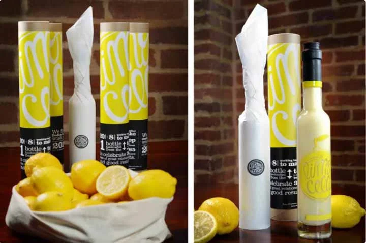
Paying attention to the application and function of the product sometimes leads to the production of interesting ideas in product packaging. For example, here is a picture of a lemonade bottle. These bottles are usually given as gifts to the landlord when going to a party. So, with the theoretical precision that the manufacturer has spent on the use and final function of this product, he has turned the bottle into a gift, which is an interesting and practical idea.
10. Use of conceptual designs
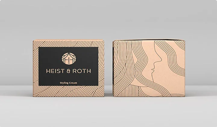
The design of your product package does not have to be very clear. Sometimes it can be interesting to use conceptual designs. For example, in the picture above, a simple design of a woman’s face and hair is placed on the package, and the facial hair lines cover the entire package. At first glance, the existence of these lines may not be fully understood, but with a closer look, while being aware of the shape on the package, the desired feeling will be induced in relation to the product.
This story continues.

